Akebono Brake Pads

Client: Akebono North America | Industry: Automotive | Region: Detroit, MI | Agency: Gyro Creative
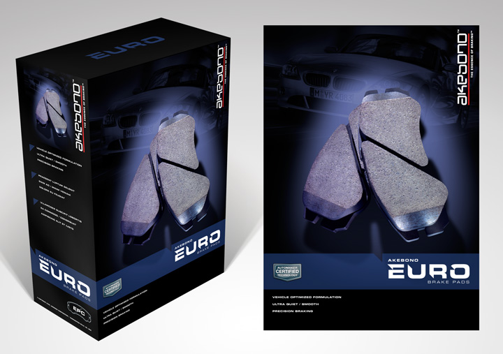
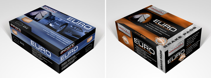
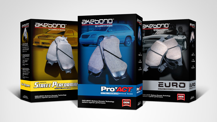
Akebono North America were looking to update their packaging. They wanted a clean, unified look, that elevated the brand while also recognizing the distinct differences between products. One requirement was the incorporating of duplicate bi-lingual information. A new identity was created for the EURO model, their premium product. To simplify the layout, non-essential information was printed on the inside flap.


 Scott Auch